What is it about Communism that’s incompatible with color?
The Communist world was a gray world.
In one book alone, a writer manages to make Berlin seem like the grayest place on earth. The city is characterized by “monstrous expanse[s] of gray concrete,” with “gray buildings, gray earth, gray birds, gray trees,” and buildings that are covered with “gray sprayed-on concrete,” and “cluster[s] of cold gray buildings,” with “gray paint peel[ing] off the walls.”
…but was it really?
When I hear something repeated over and over again as if it’s a fact, I have a very contrarian urge to say: prove it. This is especially true in cases where the origin or the root of the statement is unfindable. In this case, did grayness become a fact because people living in the Communist world proclaimed it to be true, or because this is how Western journalists described it?
What is it about Communism that’s incompatible with color?
And what’s so good about color? Would I willingly, even happily, turn my world 10 or even 20% more gray if it meant I had affordable health care, free childcare, free education, and affordable housing? If you asked me right now, I’d say yes. Because instead, I live in a world where my health insurance costs went up $425 per month because my hospital and the insurance company couldn’t come to a payment agreement, because corporate greed.
In any event, would I even have to make this trade off? What is it about communism that prevents colorfulness — and is this rooted in historical fact? The other way to look at this question might be to ask: What causes grayness? Typical answers might include: Brutalist or Soviet architecture; prefab concrete; limited consumer goods (although is it always cheaper to make something less colorful?); and coal smoke. And, of course, sameness. One way to make gray is to mix otherwise colorful colors together, until they’re balanced out to a single shade of gray. Is this what happens when we imagine Communism?
Outside of our typical answers, there are also real historical conditions that contributed to grayness (don’t worry, I don’t think it’s all a product of faulty collective memory or Western exceptionalism). These conditions were largely shaped by the Second World War, and the complete destruction of so many cities and places. One of the quickest ways to rebuild, especially mass housing, was with prefab concrete construction (more on this in a moment). And we can easily imagine how much more gray this was than the varied historical architecture it replaced.
So, we have some historical conditions, some assumptions, some memories. Can we prove or disprove the truth of grayness? To get anywhere towards an answer, we need to start with some basic conditions.
There is no such thing as grayness.
Your first google search about grayness (maybe something like “how to tell how much gray is in an image”) will immediately show you that grayness doesn’t really exist.
Instead, grayness is entirely perceptual.
There is no single, standard, scientific or mathematical definition of gray. There is no list of RGB values that defines where blue starts and gray ends, how much R or G a color has to have to become red or green. Instead, it’s left up to human eyes to make that determination, everyone for themselves. And it’s been very well established that people have wildly different perceptions of color. It’s even possible that the same color might look slightly different, depending on what eye you look out of. Without a set mathematical definition, we can’t say something like “gray is every color with a saturation of 35% or less.”
Gray is what we think it is. In a way, grayness is created by other colors — and vice versa. For example, look at these two colors next to each other. Most people would be likely to call these colors red and blue (or reddish-brown and grayish-blue). However, look at them again — this time with a neutral gray in the middle (#D3D3D3). Now, both colors appear more gray. At least, they do to me.
So our perception of gray seems to make what’s around it more or less colorful. But what makes gray gray?
Grayness is always a mixture.
Did you know that Khrushchev once gave a two hour long speech about concrete? This 1954 speech made it “clear to everyone…that we must proceed along the more progressive path – the path of using prefabricated reinforced-concrete structures and parts.” (Applause.) After all, “[i]n
our age – given the availability of concrete, electric motors, cranes, and other mechanisms – we have no excuse for continuing to employ the old methods of working.”
So we might correctly assume that at least a large part of the gray we’re about to see is indeed the gray of Soviet architecture: large prefabricated concrete forms, slotted together to make high rises and mass housing. Of course, public housing projects in New York City were often built with similar Brutalist principles in the 1970s (and had been under construction since the 1930s). While concrete is a substantial factor, it doesn’t entirely answer the question on its own.
But there are other ways to make gray. And each, like concrete, involves a mixture. As a painter, I could make gray by:
- Mixing two opposite colors together. Opposite colors are those directly opposite each other on the color wheel. So to make gray, I could mix red and green or blue and orange.
- Mixing every color together. I might wind up with brown, but somewhere along the way I’ll get to gray.
- Mixing white and black. This is probably the easiest, most intuitive way to make gray. But many painters (myself included) were taught not to paint with white, and sometimes not with black. This goes back to Renaissance and Medieval painting theory, under which mixing colors was tantamount to heresy: after all, God created colors. And if He created them, they’re already perfect and don’t need mixing. Later, the Impressionists eschewed black and white, in favor of the bright, new, industrially-produced pigments that were then becoming available. But in any event, it’s good to be resourceful — you might not always have black and white.
Research questions and methodology
Was Communism fundamentally more gray than capitalism?
Within the bounds of the conditions outlined in the introduction (there are many heterogenous factors to producing grayness, which itself is entirely something we see, or don’t see, for ourselves), this is essentially what we’re setting out to understand — to prove or disprove. Fundamentally meaning that in every situation this will prove true; that there is seemingly no way to enact Communism without a more gray society and that, inversely, transitioning to capitalism will always bring more color.
So, with that in mind:
Was East Berlin more gray than New York City circa 1970?
To me, this question gets immediately to the heart of the matter: a direct comparison of two different places, one Communist and one capitalist, during the same time period. To compare these cities, I’ll compile a dataset of images from each place, from between 1968 to 1972. The images will be film photographs, taken by amateur and professional photographers, from publicly available archives. Instead of picture postcards, street scenes should give a better idea of what ordinary people were seeing and walking past on a daily basis.
So with our first question, we’re comparing like with like, apples with apples: two cities, in similar geographies with similar weather. And the climate might be especially important. Consider London, for instance. A city as capitalist as any other and even, maybe, with its red buses and iconic phone booths, a contender for most colorful — but all that color is drenched in gray rain and drizzle most days out of the year. When we’re looking at film photos, these weather conditions are especially important, and not only because of how they appear in the image. Film is sensitive to temperature and humidity, in both the physical substrate of the film itself and the light-sensitive emulsion. This is especially true of color film: when shot at or processed at wildly different temperatures, color film can become more or less colorful, or take on a blue or green cast. But with similar climates, we have a good chance of finding film photos from New York and East Berlin that were taken and processed in similar conditions.
Did Moscow become more colorful after 1990?
With this question, we’re working with the same conditions as above: analyzing color photographs of Moscow drawn from publicly available archives. I’ll collect images taken of Moscow between 1968 and 1972 for our first dataset, then collect images taken of Moscow after 1995 for comparison. The photos will be collected and analyzed using the same methods as our New York and Berlin photos.
But now, we’re no longer comparing like with like, but apples with oranges, in order to understand whether the same place will look different or the same, more or less colorful, under Communism and under capitalism. Rather than comparing the same point in time, we’re trying to understand the effects of a historical process.
It would be impossible to prove, probably, but I do wonder if there was a point — maybe circa 1992 or 1993 — when post-Soviet countries were transitioning and Communist and capitalist countries were precisely the same amount of gray? Maybe the way to pinpoint this date is to determine when Hungary and Indiana or Poland and New Mexico had the same number of McDonalds. Just a thought. We have enough to get started with as it is.
Methodology
Even though there’s no such thing as grayness, it’s still possible to think about grayness systematically. Now that we’ve determined our research questions, we have to decide how we’re going to gather our images and then analyze their grayness. To do so, we’ll need to:
1. Gather different ways to look at and measure grayness.
To start with, we have to decide how we’re going to measure the grayness of an individual color. Each color space can generate its own way of understanding or measuring grayness. I evaluated these measures:
Using RGB values, option #1
First, I chose a simple method using RGB values. These values represent the Red, Green, and Blue values of a color. In this color space, gray is defined as a set of RGB values with a high degree of similarity between the values. A neutral gray would be RGB values of 128, 128, and 128. Essentially, this means the color isn’t toned in any particular hue, thus appearing neutrally gray. Within the gray of this color space, we can say that a color is more or less gray depending on the distance of its values from neutrality. In other words, the more similar the RGB values, the more gray the color, and the more dissimilar, the more colorful.
To measure the distance from neutrality, I used this calculation:
Grayness = Highest RGB value – Lowest RGB value
For example,

has the HEX code of #6ad4ee and RGB values of 106, 212, 238. In this case:
Grayness = 238 – 106
Grayness = 132
In contrast,

has the HEX code of #acb2aa and RGB values of 172, 178, 170. For the color #acb2aa, grayness has a value of 8. With just two examples, we can start to see that the higher the difference in RGB values, the farther the color is from a neutral gray.
Using RGB values, option #2
Rather than using the maximum difference between RGB values, we could also measure the average difference. This option was suggested by ChatGPT. Using average differences, we would say:
Average RGB value = [R + G + B] / 3
Grayness = {[Average RGB value – R] + [Average RGB value – G] + [Average RGB value – B]} / 3
Then, we would look at the distance from this average for each of the RGB values, by simply subtracting the R, G, and B values from the average. This would ultimately give us a second average, representing the average distance from neutrality. Like the first option using RGB values, the higher the distance, the less gray the color.
Using saturation
Intuitively, it might make sense to think that the saturation percentage of a color is a direct stand-in for grayness. However, it isn’t this simple.
We could look at a relatively neutral gray like this and see that it has a saturation of 4%. So far, it makes sense to say that the lower the saturation, the more gray the color.
But the difficulty comes in determining the difference between colors of similar saturation.


Based on human perception, I think we would struggle to say which color is more gray. And on this count, saturation percentage does differ from several other calculations.
What it comes down to is that different colors can have the same or very similar saturation, but be toned to completely different hues — and therefore one will appear more gray than the other, regardless of the “real” saturation. Therefore, saturation alone is not a reliable measure of grayness.
Using LAB values
Another option would be to work in the CIELAB color space and use a calculation based on LAB values. This is, perhaps, the closest we can come to an agreed-upon or standard calculation for grayness (even if it seems that not many people have a need for measuring grayness mathematically).
CIELAB is a three-dimensional color space, in which the a and b values represent two axes for green-red and blue-yellow values, respectively. Somewhat like our first RGB calculation, we can use LAB values to convert the a and b values from Cartesian coordinates into polar coordinates, and therefore determine their distance from neutrality, or the distance from gray.
The calculation for this conversion is:
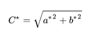
C* represents Chroma and relative saturation. With this calculation, we see that the lower the C* value, the more gray the color.


Using a Python-based application
Finally, I asked ChatGPT to recommend to me a method for measuring grayness. The prompt was: “Tell me how gray this image is. Quantify the overall level of gray.” I then uploaded an example image, an East German postcard from the 1970s.
ChatGPT analyzed the image by:
- Converting it to grayscale
- Calculating the pixel intensity value of every pixel
- Averaging the pixel intensity values to arrive at an average overall grayness
To replicate this process without the use of AI, I would need to use a custom-built Python application to analyze a database of images. However, only ChatGPT suggested this method; I could not find a human on the internet that made a similar recommendation. Additionally, this method still arrives at an average, not a quantity.
Using perception
To better look at differences between each calculation, I also organized my set of sample colors into the scale that, perceptually, I felt represented most to least gray.
2. Compare and choose a single measurement.
After testing the calculations, I looked at the different scales that each calculation produced for my set of test colors, shown in Table 1.
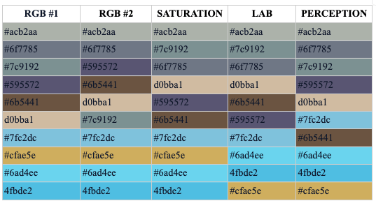
Table 1. This table shows the different ranges of most to least gray produced by each calculation. Because the ChatGPT suggestion of calculating pixel intensity looked at the overall grayness of an image, rather than the grayness of the image’s colors, it’s not included in this table.
As illustrated by Table 1, the different calculations all agreed about the color that’s the most gray. There’s also a high degree of agreement about the colors that are least gray. However, in the middle ranges, none of the calculations are consistent with each other.
Ultimately, I chose to move forward with the calculation for arriving at the C* value, working in the CIELAB color space. This calculation was most often mentioned as typical or standard in sources I consulted, and it represented a human-level calculation (i.e., wasn’t something only a Python script could reasonably complete).
3. Determine how to use the C* values to calculate the overall grayness of an image.
I will use an online tool to generate a palette of between 6 to 12 colors for each sample image. This palette is auto-generated and represents what are, proportionally, the most common colors in the image.
I will calculate the C* value of each color, using LAB values. I will then average the 6 to 12 C* values, to arrive at the average level of grayness of the image. This overall grayness value will essentially represent how gray the colors of an image are.
Of course, there are some caveats:
- None of the calculations yields anything better than an average. Even the ChatGPT application that analyzed every single pixel in an image only arrived at an average.
- It is not feasible to calculate the C* value for every single color of an image. And, I would argue, it’s not necessary. An average is just as representative as using nearly identical values for nearly identical colors, especially ones that most humans would struggle to differentiate, like these two reds:


4. Set parameters for the dataset of images; gather images.
What type of images should we look at? I wanted to capture a range of views, focusing on daily items and spaces, and the overall cityscape.
I started by compiling the dataset of East German images. Using the Deutsche Fotothek archive, I searched for the terms “DDR” and “Berlin,” then narrowed the date parameters to 1968-1972. I gathered as many relevant photos as I could. I focused on:
- Color photographs
- Street scenes showing buildings, cityscapes, aerial views, and people
- Any portrait or interior scene
For images of New York City, I used images from 1968-1972 from the Department of City Planning and Department of Records and Information Services. These photos showed street scenes, people outside, and interiors, in a similar mix to the East German image set.
5. What images should be excluded?
Scrolling through the Fotothek archive, it quickly became apparent that I would have to exclude some types of photos. This includes:
- Black and white photographs, for obvious reasons.
- Night scenes. These photos were too dark to draw substantive color information from.
- Artistic shots and backlighting. Some photos were purposefully backlit, or shot through other objects, thus creating large black areas or frames. Devices like this unnecessarily obscured color information, and didn’t represent what an average person walking through the city might see.
Of course, we’ll omit the same types of photographs for each city’s dataset. Beyond omitting images altogether, I did not crop or otherwise adjust any of the images that will be included in our dataset.
6. What about film quality?
It’s true: differences in color film or in the chemistry used to process color film can result in differences in photo quality or overall color. We’ll omit any photos that are purposefully or otherwise toned to a single color.
Summary of finalized methodology
The final testing protocol was:
- Gather 50 images each of East Berlin, New York City. Gather 50 images from Moscow between 1968-1972, and 50 images from Moscow taken after 1995.
- Upload each image to the TinEye tool. This tool generates a palette of 6 to12 colors that is proportionally representative of the image.
- Gather the LAB values for every HEX code listed in the palette.
- Calculate the C* value for every color. Average the C* values for each image.
- When all the images have been tested and C* values calculated, average the C* values of all images in the dataset, to produce an average measurement of grayness for each city.
Results
Was East Berlin more gray than New York City circa 1970?
In a word, no. As my (native New Yorker) mother-in-law immediately predicted when she heard about this project: nothing was more gray than New York in the 70s.
I calculated the average C* value of 50 images of East Berlin from 1968-1972. The average C of East Berlin circa 1970 is 18.20403413. Further results are in Table 2.
| Value | Result |
|---|---|
| Minimum C* value | 9.568487533 |
| Maximum C* value | 29.64092635 |
| Median C* value | 18.14763275 |
| Average C* value | 18.20403413 |
Table 2: C* values in the East Berlin dataset
I then calculated the average C* value of 50 images of New York City from 1968-1972. The average C of New York City circa 1970 is 14.05653111. Further results are in Table 3.
| Value | Result |
|---|---|
| Minimum C* value | 6.100969549 |
| Maximum C* value | 28.47434283 |
| Median C* value | 13.30627318 |
| Average C* value | 14.05653111 |
Table 3: C* values in the New York City dataset
Overall, I found 485 unique colors in the East Berlin photographs. In the New York City dataset, there were 415 unique colors. The most common colors for each city are shown in Table 4.
| Most common colors | |
|---|---|
| East Berlin | New York City |
| Gray | Gray |
| Orange | Red |
| Green | Black |
| Red | Orange |
| Blue | Blue |
Table 4: The colors most frequently found in the images in the East Berlin and New York City datasets.
Therefore, we can say that — within the parameters of our current tests — New York City in the 1970 was more gray and less colorful than East Berlin in 1970.
Did Moscow become more colorful after 1990?
I tested the C* value of 50 images of Moscow, taken between 1968-1972. The average C of historic Moscow is 17.4901377. Additional data is shown in Table 5.
| Value | Result |
|---|---|
| Minimum C* value | 6.947448554 |
| Maximum C* value | 34.32759287 |
| Median C* value | 17.91828571 |
| Average C* value | 17.4901377 |
Table 5: C values in the historic Moscow dataset.
I then tested the C* value of 50 images of Moscow taken after 1995. The average C of contemporary Moscow is 18.43960688.
| Value | Result |
|---|---|
| Minimum C* value | 9.647134079 |
| Maximum C* value | 37.40310209 |
| Median C* value | 18.25690805 |
| Average C* value | 18.43960688 |
Table 6: C values in the contemporary Moscow dataset.
Overall, I found 442 unique colors in the historic Moscow dataset. In the contemporary Moscow dataset, I found 457 unique colors.
So, yes: Moscow did become more colorful after Communism. When looking at the average C* values, the difference is quite small, only 0.95. However, the minimum C* values might tell a slightly different story: the minimum C* value in the contemporary Moscow dataset is almost 3 points higher than the minimum of the historic Moscow dataset. This suggests that the baseline level of colorfulness has increased more significantly than the average alone may show.
Comparing across cities
| Data point | East Berlin | New York City | Historic Moscow | Contemporary Moscow |
|---|---|---|---|---|
| Minimum C value* | 9.568487533 | 6.100969549 | 6.947448554 | 9.647134079 |
| Maximum C value* | 29.64092635 | 28.47434283 | 34.32759287 | 37.40310209 |
| Average C value* | 18.20403413 | 14.05653111 | 17.4901377 | 18.43960688 |
| Number of unique colors | 485 | 415 | 442 | 457 |
Overall, the most to least gray cities and time periods were:
- New York City, 1968-1972
- Historic Moscow
- East Berlin
- Contemporary Moscow
New York City’s average C* value is 4 points below contemporary Moscow’s, but the other three cities are not more than 1 point away from each other. Table 8 shows this trend quite clearly.
Table 8. All C datasets overlaid.
When it comes to the number of unique colors, East Berlin had the most colors. However, contemporary Moscow had the highest C* found of any image, a whopping 7.76 points over East Berlin, suggesting the city must reach dizzyingly colorful heights, of which I can only imagine.
Conclusion
Of course, there were a million different things we couldn’t control for. We can’t control what people take photos of, nor can we control what images get saved or what images are made publicly findable and available.
So was this experiment mathematically and scientifically sound? Probably not. But was it representative of a fundamental something, some intrinsic difference between the Communist and capitalist worlds? Yes. Because at the end of the day, we’re dealing with 200 representative images, and these images do tell a story.
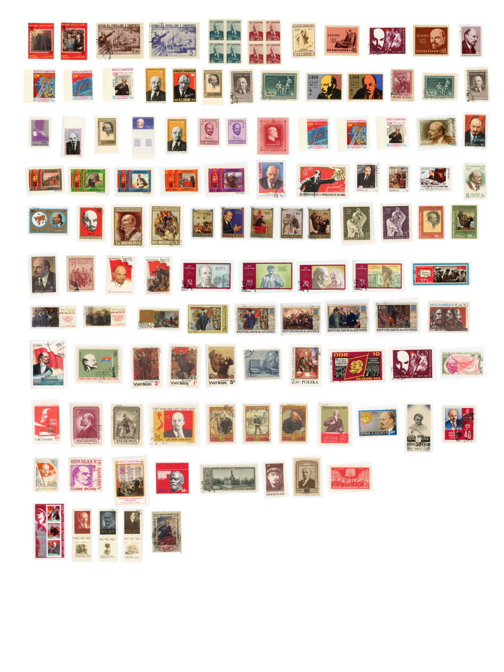
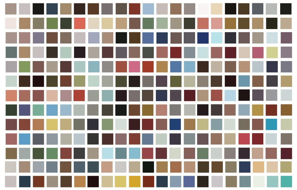
Appendix A: All of the colors of Communism
All the colors of East Berlin, 1968-1972