Russia is red, the US is blue, I gathered all these book covers so you don’t have to.
My central hypothesis going into this “experiment” (was it well designed, free of bias and error? nope!) was simple: Every book about Russia has to have a red cover.
This is a hypothesis born of simply looking at my own bookshelves:
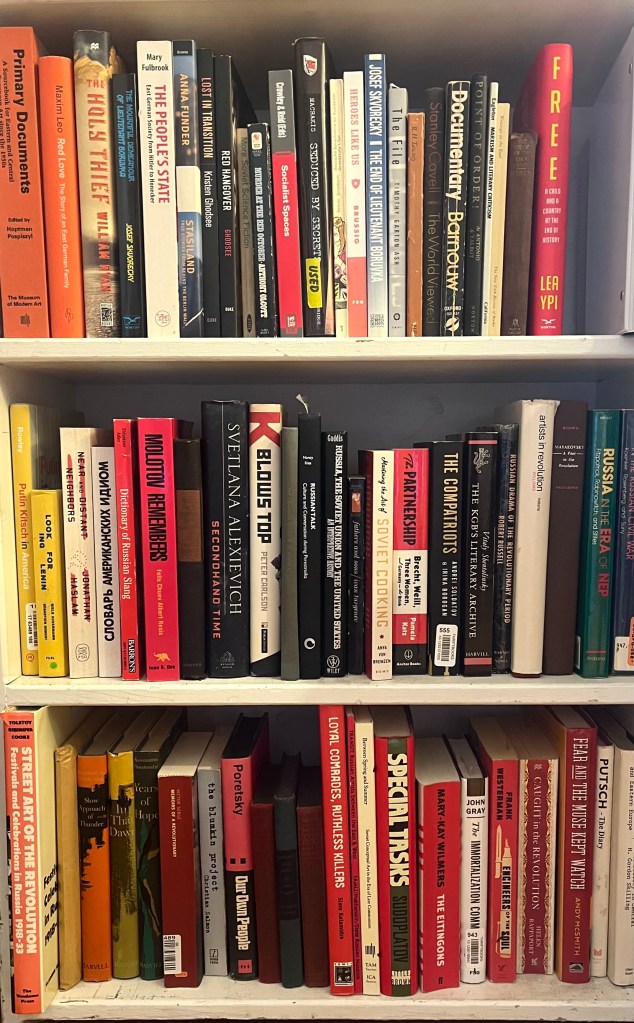
The white and black books on the top shelf are East Germany, which is offsetting our sample here.
In comparison, here’s a stack of random, mostly gardening, books:
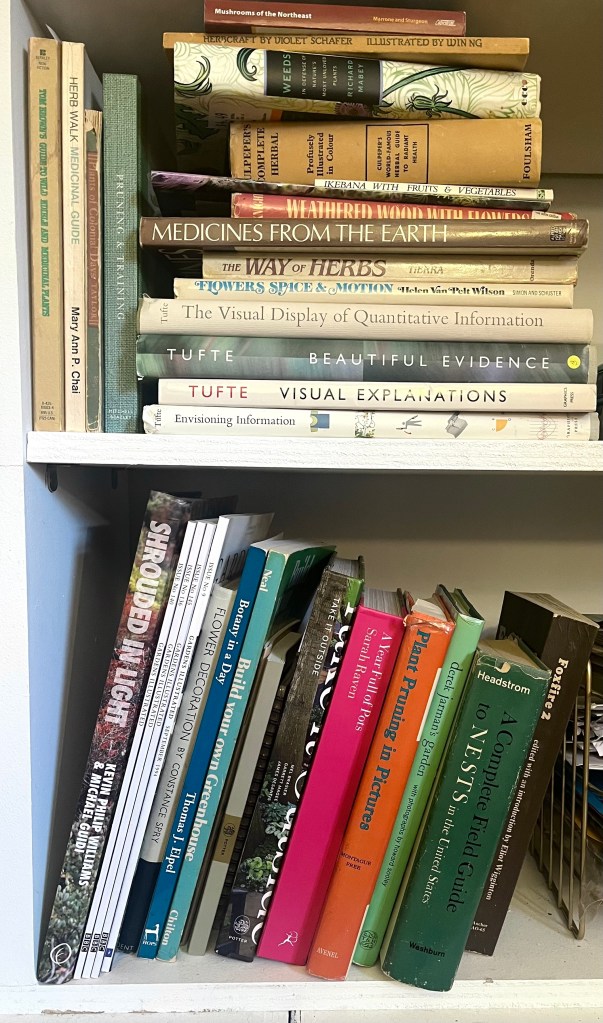
Shrouded in Light is a phenomenal book on shrub lands.
What I did
My data collection was simple: I used the subject headings for Russian history and American history in the Boston Public Library’s catalog, then downloaded images for any books that had a cover image. This only gleaned so much, so I repeated the search on Amazon. I excluded self-published books and extremely narrow topics, focusing instead on general Russian and American history and espionage books. I recorded the book’s title, publisher, and year published.
I then recorded the primary, secondary, and tertiary colors of each book’s cover. This was not mathematical: it was a qualitative look at what colors were dominant on a given cover. For black and white photographs, I recorded grey. Lastly, I noted whether a hammer and sickle or star symbol was on the cover.
What I found
Red really is everywhere: Every single Russian book used red somewhere.
50% of the books had red as a primary color; books about the KGB were slightly more likely to use a primary red than general history books.
Black or grey was the next most common primary color, followed by white. All books that had black, grey, or white as the primary color were published between 2010-2023. A mix of publishers (Verso, Skyhorse, Random House, and University of Pittsburgh all fell into this category) used black, grey, or white as a primary color, although literary books were more likely than popular/general audience books to do so. Even within these books, red was still the secondary color for about 83% of books.
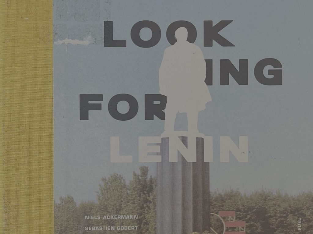
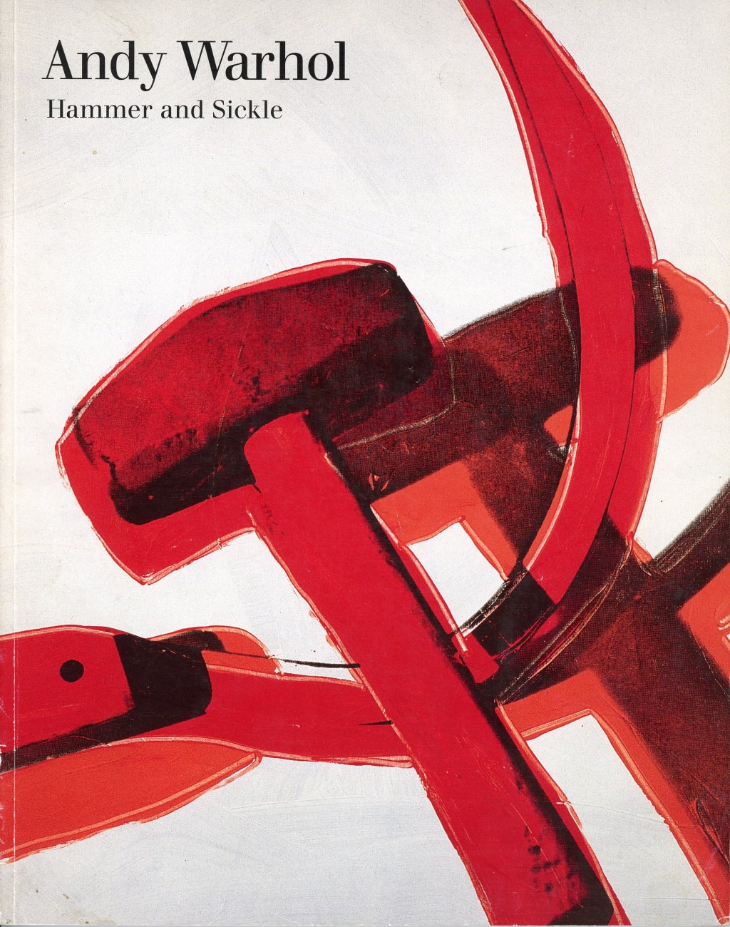
Surprisingly, only about 20% of the covers had a hammer and sickle or star symbol.
In comparison, in our US dataset, only 12% of books had red as a primary color. The most common primary colors were blue and white, both at 38%, followed by grey or black (12%). However, 71% of the books had red somewhere — but of these, only 6 books used red without blue.
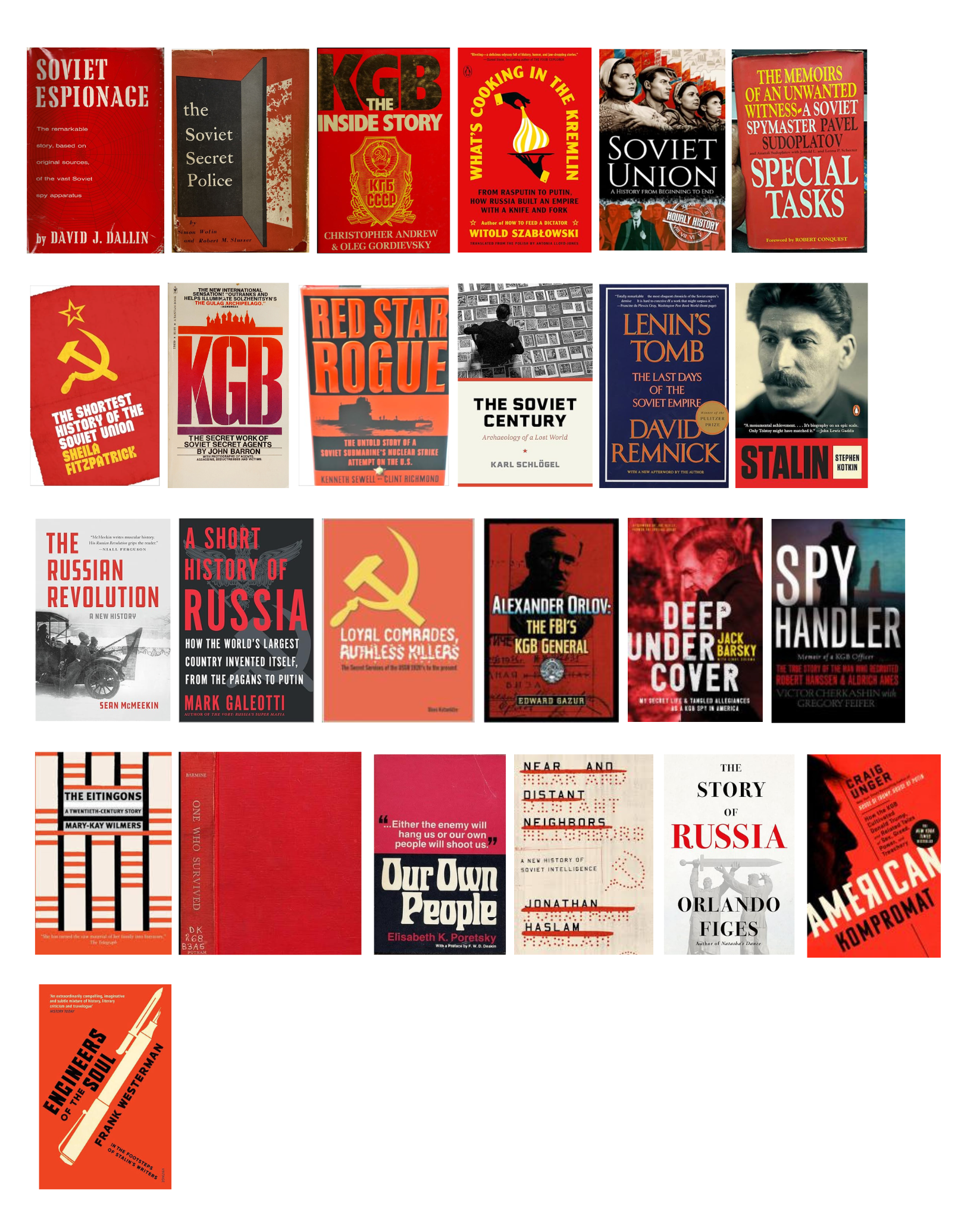
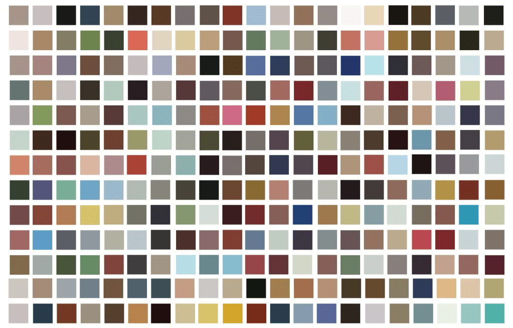
The Russian book cover dataset
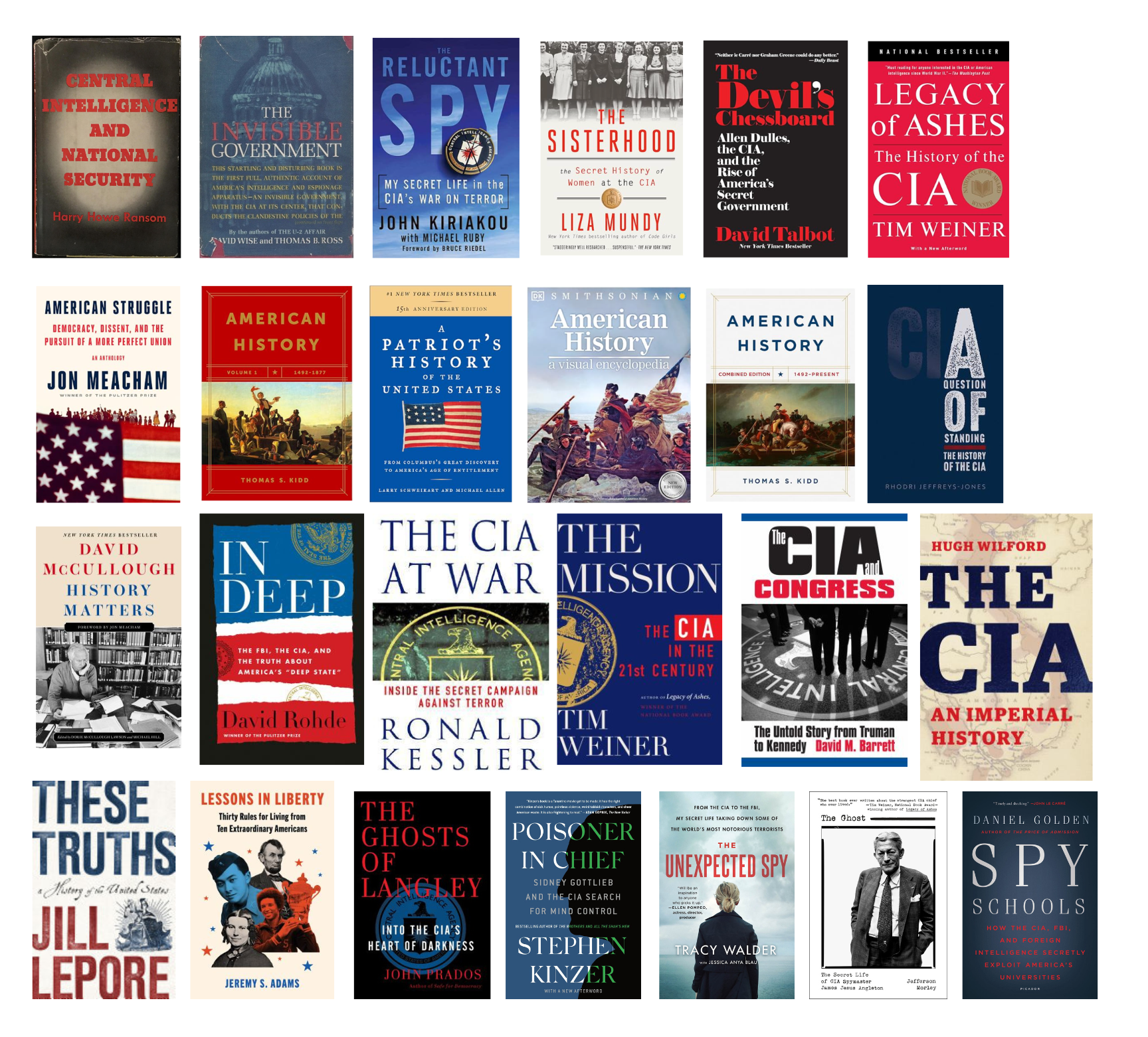
The US book cover dataset
Red is certainly persistent, and this has a long history: In this dataset, Russian books with red as the primary color were published between 1945 to 2022.
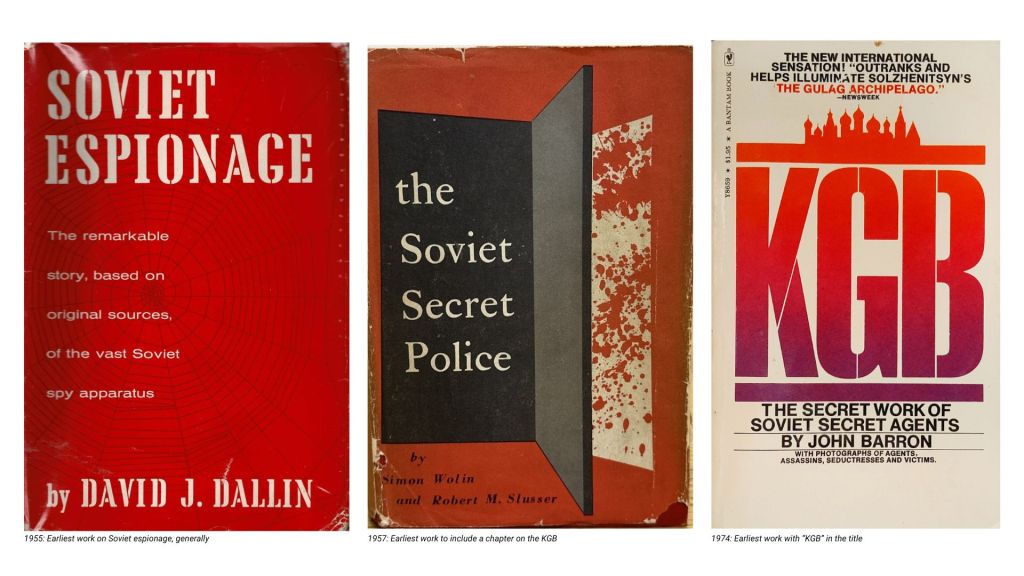
Overall, it seems the design patterns were set early on. The earliest books about Russian espionage are Soviet Espionage (1955), The Soviet Secret Police (1957), and KGB: The Secret Work of Soviet Secret Agents (1974, the first book to use “KGB” in the title, and which also makes me wonder how many other titles use the same word twice).
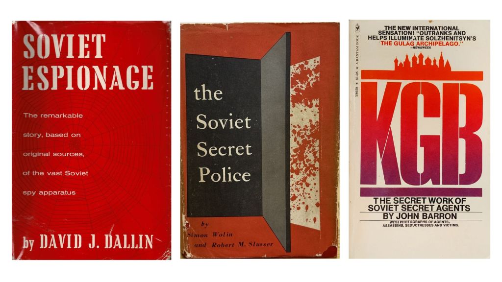
Soviet Espionage (1955), the earliest work on Soviet espionage; The Soviet Secret Police (1957), the earliest work to include a chapter on the KGB; KGB (1974), the earliest work with “KGB” in the title.
In comparison, two of the earliest CIA books are Central Intelligence and National Security (1958, which sets the red + black + white pattern still used on covers like The Devil’s Chessboard, 2016) and The Invisible Government (1964).
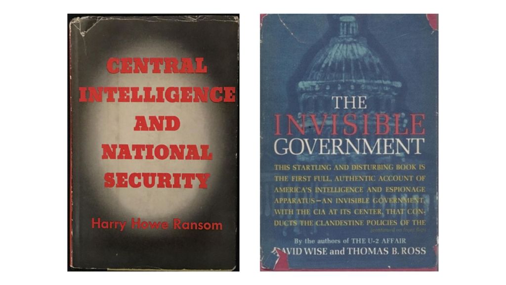
Central Intelligence and National Security (1958), first published study of the CIA; The Invisible Government (1964), first CIA exposé.
The next logical step would be to assemble an entire catalog of country-based book design: The first page of search results in Boston Public Library’s catalog would suggest that China’s requisite colors are red and yellow (but if you also add black, it could be a book about Germany). Neutral Switzerland is a nice calm beige.
In the end, would these findings replicate with a larger dataset? Regardless of my less-than-rigurous experiment design, the pattern I found was consistent enough that it’s likely more than noise — and it’s certainly old enough. Publishers found a color code for Russia sometime in the Cold War and mostly never let go of it.